










Wall Art for the Living Room: A Room-by-Room Playbook
Most people buy wall art the way they buy milk: quickly, under pressure, and slightly guilty about the price. Then it sits in a tube behind the wardrobe for six months. The fix isn't better taste. It's a plan.
This is a playbook for choosing wall art for the living room, broken down by the actual zones you look at every day. Sofa wall, sideboard, awkward corner, the bit by the door. Work through them one at a time and the whole room starts behaving.
Start by mapping your living room zones
Before you look at a single print, walk into your living room and stop in the doorway. Notice where your eyes land first. That's your hero wall, and it deserves the strongest piece in the house.
Then map the rest. Most living rooms break down into four or five zones, and each one has a different job to do.
- The sofa wall: your biggest surface and usually the hero.
- The sideboard or media unit: a lower, layered zone where art sits behind objects.
- Awkward corners and narrow strips: between windows, beside doorways, above a radiator.
- The entry sightline: whatever you see walking in from the hall.
- The reading or armchair nook: quieter, more personal, closer to the eye.
Naming the zones stops you from buying five pieces that all want to be the star. A room full of statements is just noise.
Choosing wall art for living room walls, zone by zone
Above the sofa: go bigger than feels sensible
This is where most people undershoot. A small print floating above a three-seater looks apologetic. Aim for art that spans roughly two-thirds the width of the sofa, either as one large piece or a tight pair.
Hang the centre of the artwork around 145–150 cm from the floor, or about 20–25 cm above the sofa back. Any higher and it starts drifting away from the furniture it's meant to belong to.
A piece with real presence works beautifully here. High Class Place has the kind of confident composition that holds a sofa wall without shouting at your guests, which is a rarer skill than it sounds.

Above the sideboard: layer, don't centre
Sideboards and media units already have things on them: lamps, books, a bowl of keys nobody uses. Art here works as a backdrop rather than a centrepiece.
Try leaning a framed print against the wall instead of hanging it, then overlap it with a shorter object in front. The slight imperfection reads as lived-in rather than staged.
If you do hang it, leave 15–20 cm of breathing room above the surface so the art and the objects don't collide visually.
Awkward corners: narrow art, long looks
Every living room has one. The strip between two windows. The sliver beside a doorframe. The patch above the radiator that nobody knows what to do with.
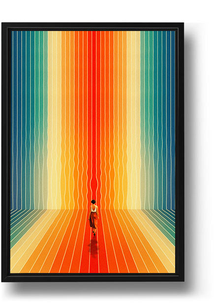
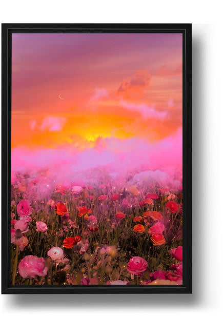
These spots reward calmer, more atmospheric pieces, the kind you notice on your second lap of the room. Walking the Course has that quality — open space, a sense of distance, something to rest your eyes on rather than something that demands attention.

The entry sightline: set the tone early
Whatever you see from the doorway sets expectations for the whole room. If your sofa wall already handles that job, great. If the doorway points at a blank side wall instead, put something there worth walking towards.
This is the one zone where you can be bolder than the rest of the room, because people see it in passing rather than staring at it for two hours with a coffee.
Sizing, spacing and the measuring tape rule
Three numbers solve most living room hanging problems:
- Two-thirds: art should span about two-thirds the width of the furniture beneath it.
- 150 cm: centre height for standing-eye viewing in most rooms.
- 5–8 cm: the gap between pieces in a gallery wall or pair. Tighter than you think.
Before you put a nail in anything, cut paper rectangles to size and tape them up. Live with them for two days. It costs nothing and saves you from a wall that looks like swiss cheese.
If you're building a multi-piece wall, treat the whole cluster as one rectangle. Decide its outer edges first, then arrange inside those boundaries. Gallery walls fail when they grow outwards with no plan.
Framing, colour and keeping a room coherent
Frames do more work than people credit. A consistent frame colour across different artworks creates instant coherence, even when the pieces have nothing else in common.
Black frames sharpen and modernise. Natural oak softens and warms. White disappears into pale walls, which is either elegant or invisible depending on your art. Pick one and commit across the room.
On colour: pull one or two shades from your art into the room's textiles. A cushion, a throw, a ceramic. Two touchpoints are enough to make the art feel chosen rather than added.
A room doesn't need matching art. It needs art that agrees on something — colour, frame, mood, or scale. Pick one agreement and let the rest be different.
If budget is shaping your choices, there's no shame in building slowly. Our guide to finding affordable wall art for your living room covers how to get a full wall together without doing it all in one go.
Building the room over time, not overnight
The best living rooms look collected, not delivered. Start with your hero piece on the sofa wall, live with it for a few weeks, then add the next zone once you know how the light behaves across the day.
Morning light flattens colour. Evening lamplight deepens it. A print that looks perfect under a showroom spotlight can read completely differently at 8pm in a north-facing room.
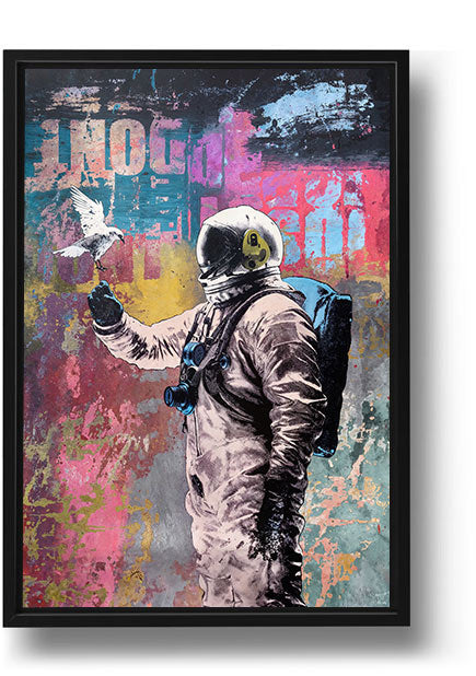
If you want help narrowing the field before you buy, how to choose the perfect wall art for your living room walks through mood and subject matter in more depth. For something with atmosphere and scale, space wall art is a reliable route to drama, while Japanese wall art leans calmer and more restrained.
One more thing worth knowing: a share of every Andy Okay order goes to charity. You get a wall you're proud of, and something good happens quietly in the background. That's the whole idea.
Take it zone by zone. The living room will come together faster than you expect, and it'll look like you meant it.
Common Questions About Wall Art for the Living Room: A Room-by-Room Playbook
How big should wall art be above a living room sofa?
Aim for art that spans roughly two-thirds the width of your sofa, as a single large piece or a tight pair. Anything smaller tends to look lost against a three-seater.
What height should I hang wall art in a living room?
Hang so the centre of the artwork sits around 145–150 cm from the floor. Above a sofa, that usually means 20–25 cm of gap between the sofa back and the bottom of the frame.
How do I choose wall art for an awkward narrow space?
Narrow strips between windows or beside doorways suit calmer, more atmospheric pieces with a sense of depth. They reward a second look rather than competing with your main wall.
Should all the frames in my living room match?
They don't have to, but one consistent element helps. Matching frame colour across different artworks is the easiest way to make a mixed collection feel deliberate.
Is it better to buy living room art all at once or gradually?
Gradually, in most cases. Start with the hero piece on your main wall, live with it through different light conditions, then add the other zones once you know what the room needs.


